Storytelling on Paper Bags: Text Customers Actually Read
Most branded bags say one thing: the name of the business. That is enough to be recognised, but it leaves a large printed surface unused. Storytelling on paper bags means adding a few words that explain who you are, what you care about or how the product was made. Done well, it gives the customer […]
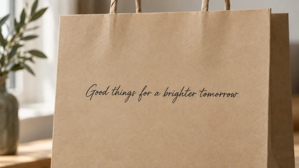
Most branded bags say one thing: the name of the business. That is enough to be recognised, but it leaves a large printed surface unused. Storytelling on paper bags means adding a few words that explain who you are, what you care about or how the product was made. Done well, it gives the customer something to read on the way home and a reason to remember you. Done badly, it is a block of small text nobody notices. The difference comes down to length, placement and how the text is printed.
What a bag can say that a logo cannot
A logo identifies. A line of text explains. Good bag copy usually answers one of these questions:
- Where does it come from? “Baked every morning in our kitchen on Pyatnitskaya Street.”
- Who makes it? A founder’s name, a family business, a small team.
- What do you stand for? Seasonal ingredients, repairable clothing, local suppliers.
- What should I do next? Keep the bread in paper, come back on Saturdays for the market, reuse the bag.
Pick one. A bag is not a brochure, and trying to answer all four produces text that is too long to read at a glance.

Stable Supply Chain
Choose ready-made solutions or custom printing with quality guarantee.
Keep it short: how much text fits
People read a bag in passing: while it is handed over, while they carry it, when they put it on a table. That leaves a few seconds. Practical limits:
- Headline: up to about eight words. This is the line most people will read.
- Supporting text: two or three short sentences at most, for those who look closer.
- Sign-off: the brand name, an address or a website.
Write the text, then cut it by a third. If a sentence can be removed without losing the meaning, remove it. Concrete details work better than adjectives: “flour from a mill in the Tula region” says more than “the finest natural ingredients”.
Where text gets read on a bag
Placement decides whether text is seen at all.
- Front panel: logo and, if space allows, one short line. This side is seen by everyone, including people in the street.
- Back panel: the best place for a longer story. It faces the customer when they carry the bag or set it down.
- Gussets (sides): narrow and partly folded on flat-packed bags. Suitable for a single word, a short slogan or a website, not for sentences.
- Base and top edge: avoid text here. The base gets creased and dirty; the top is covered by hands and handles.
Keep text away from folds, seams and the area where handles are attached. Check the final artwork against the bag’s die line, the flat layout that shows where each panel and fold falls.
Printing inside the bag
The inside of the bag is an underused surface for storytelling. It is seen at a quieter moment: when the customer unpacks at home. A thank-you message, a short note from the founder, care instructions or a recipe printed inside feel personal, because the customer discovers them rather than having them presented at the till.
Inside print also lets the outside stay clean and minimal while the story lives inside. Vita Group prints inside bags as well as outside; it is worth planning both sides of the artwork together, so the colours and style match.
Type size and fonts on kraft paper
Paper bags are printed by flexography on paper with visible fibre, often with a high share of recycled fibre. Ink spreads slightly, and fine details are less sharp than on coated paper. This affects text more than anything else on the bag.
Practical rules for readable text
- Choose simple, sturdy typefaces. Fonts with even stroke width read better than high-contrast serifs with hairline details.
- Go larger than on paper documents. Text that is comfortable in a printed leaflet is often too small on a bag held at arm’s length.
- Avoid thin weights and tight letter spacing. Light weights can break up; tight letters can merge as ink spreads.
- Be careful with reversed text. White or light letters on a dark printed background are the most likely to fill in. Use a bold weight if you need them.
- Convert fonts to outlines in the final vector file (AI, EPS or PDF), so they print exactly as designed.
How fine a line or how small a letter will reproduce depends on the paper, so ask the prepress team to check the smallest text in the artwork before approval. Vita Group does not design artwork, but we do check client files for technical issues like these.
Colour: solid inks and good contrast
Text needs contrast with the paper. On natural brown kraft, dark colours such as black, deep blue or dark green read best; pale colours almost disappear. Bleached kraft gives brighter colours and more options for coloured text.
Print text in solid colours, preferably specified as Pantone references. Smooth gradients and photographic effects do not reproduce well on recycled-fibre paper, and text set on a gradient background loses legibility as the background changes. A flat, solid background behind a block of text is the safer choice. For more on how paper affects print, see our guide to choosing paper for branded bags.
A quick checklist for bag copy
- One message per bag, with a headline of up to about eight words.
- Longer text on the back panel or inside, never across folds or seams.
- Concrete facts instead of general adjectives.
- Sturdy typeface, generous size, no hairlines.
- Dark solid colour on natural kraft; check contrast on bleached kraft too.
- Text proofread by someone who did not write it. A typo printed on tens of thousands of bags stays in circulation for months.
- Nothing date-sensitive: prices, promotions and short-term offers age quickly.
The bottom line
Storytelling on paper bags works when it is short, specific and printed where people actually look. Choose one message, put the headline on the front or back panel, use the inside of the bag for a more personal note, and design the text for flexographic printing on kraft: sturdy type, solid colours, good contrast. Classic twisted-handle paper bags give large, flat panels that suit both a logo and a short story.
Have a story you want your bag to tell? Send us your artwork and brief, and we will check the files and calculate the order.
Free Quality Samples
Order test bags and verify our reliability.